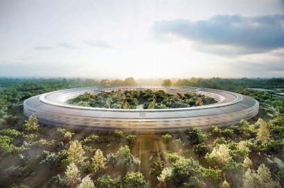
If Apple built a building, what would it be like? An article about Apple’s proposed campus by one of my favorite architecture critics, Alan Hess, caught my eye last week. “This enormous circle, this infinite loop, this shining doughnut that will be the new Apple campus in Cupertino is both impressive and puzzling”, Hess states in the San Jose Mercury News.
“If an iPad could be scaled up to building size, this would be it: The design embodies the signature aesthetic of Apple products – minimalist to the point of inscrutability – until they flash to electronic life and become a window to the universe. But what works for a device you hold in your hand does not necessarily work at the scale of an office building”, according to Hess.
Hess goes on to say, “What’s puzzling about the design, whose blueprints were made public last week, is how conventional it is conceptually. It breaks almost no new ground in reshaping the Silicon Valley workplace, and where it does depart from the norm it causes problems for itself. The new Apple campus makes no essential addition to the successful Silicon Valley high-tech campus prototype introduced at Stanford Industrial Park 60 years ago, which has become as much an architectural icon as the skyscraper. The only difference at Apple will be the packaging, provided by internationally famous architect Norman Foster.”
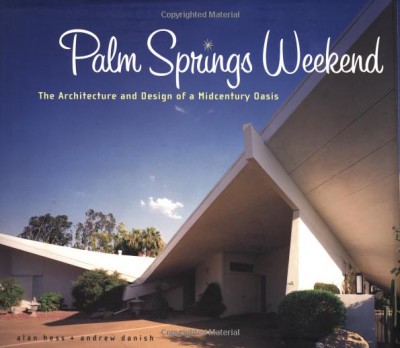
Not surprisingly, the planning process for the Apple campus is expected to last for one year. Fortunately, the discussions regarding the design of the space and the area surrounding the building are intriguing, especially as Hess sheds light on the finer points of the campus’ architecture. However, if the topic of a tech campus just doesn’t float your boat, check out some of Alan Hess’ books on other noteworthy topics including: Frank Lloyd Wright, Googie architecture, Oscar Niemeyer, John Lautner, or California ranch homes. If Mid-Century modern tickles your fancy, let me suggest the following:
This is one Hess book I could not live without!





Comments (0)