According to one of my favorite websites, Apartment Therapy, “Showhouses are a bizarre animal — and the third Showtime House is no exception. Pulling inspiration from 7 Showtime original series, the designers mix high-concept and high-design into themed rooms for the public to tour. The Showtime house is especially interesting for its inclusion of several high-tech and emerging technologies — from computerized fabrication of furniture to design-your-own wallpaper.”
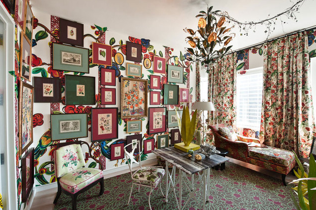
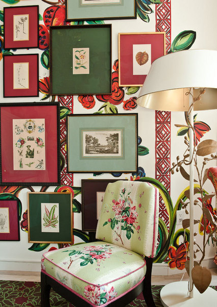
Here are a few images from the SHO House to whet your appetite. There are many more photos to see but I found these particularly intriguing. Check out all that’s going on in this lively room designed by Zatista’s very own September Guest Curator, Jason Oliver Nixon:
I’d like to take a look at this back lit art in person. I wonder if it’s digital?
A bizarre tableau of unexpected elements: flat screen TV and living plant wall framed to look like a painting, all guarded by a giant bunny and glowing egg floor lamps…!
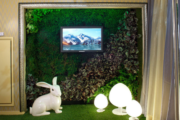
SHO House The Big C Clarity Lounge & Contemplation Room Living wall by Kokobo Plantscapes photo: apartmenttherapy.com
Speaking of bizarre, I love this trippy photo of a room with a mirrored floor. Cool reflection effect!
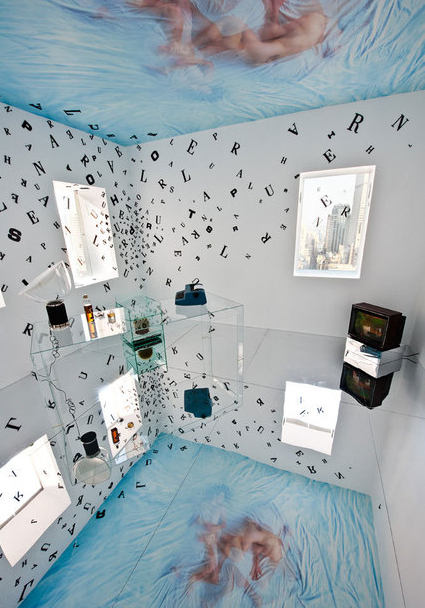
SHO House Californication: A State of Mind by ECCO Design & Space 4 Architecture photo: apartmenttherapy.com
Here’s a detail of the room that makes it a bit easier to see. I love the floating letters.
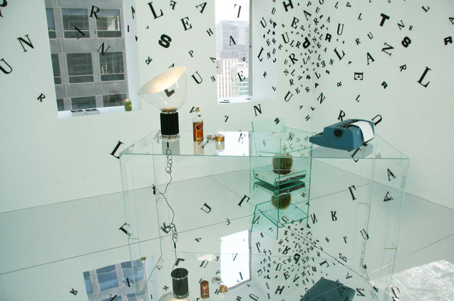
SHO House Californication: A State of Mind detail by ECCO Design & Space 4 Architecture photo: apartmenttherapy.com
Ceiling art is a good thing. The white relief work on the back wall provides great contrast to the colors and circle shapes up above.
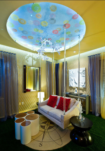
SHO House The Big C Clarity Lounge by Francesa Bucci & Hans Galutera, BG Studio International photo: apartmenttherapy.com
This is a fun effect for artwork; tile an image among a wall of frames to make a bold statement.
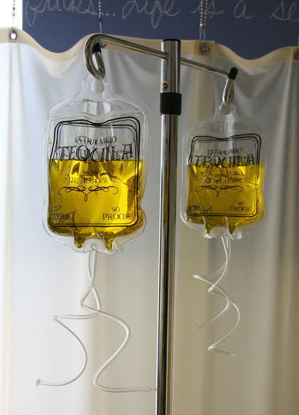
I’ve never seen the show Nurse Jackie before, but this image makes me want to start watching!
If you’ve been able to tour the SHO House, share your thoughts and comments about what you saw here on WallSpin!


Comments (0)