As seasons change this month, one of the first obvious signs is the shift from the icy colors of winter to the warmer tones of spring. Just looking up at the sky is a reminder of all the different blues there are, from the palest to the deepest, and our reactions and associations that vary accordingly.
Even without knowing that scientific research has confirmed the calming effect of the color blue, most of us have experienced the serenity of gazing up at cloudless sky, out at a body of water, or into a cluster of bluebells or blueberries. It continues to be a popular choice when deciding the color schemes of workplaces and homes.
Throughout history, blue has had many connotations both visually and linguistically. Classic and contemporary artists have found inspiration in its many moods and effects. One thing is common to all – blue makes a statement and an impression not soon forgotten.
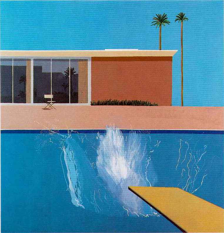
Artists as diverse as David Hockney with his clean iconic poolside images, and Van Gogh with his haunting night skies, have conveyed the power of blue. Painters of coastal themes, such as Edward Hopper, have made use of the seemingly inexhaustible palette of blues from sky to water, to shadows, to the structures and characters typical of a maritime scene.
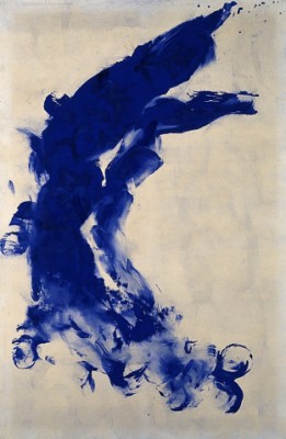
French artist Yves Klein even had a tone of blue named after him when he was the first to mix and use a unique and dramatic shade of Ultramarine. His works in this shade remain among his most compelling and recognizable.

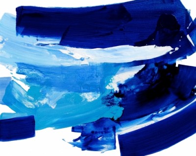
Going Home by Konnie Kim on Zatista.com
So, next time the weather allows for a long walk outdoors, or even if you are indoors, have a look around at all the different blues around you. Then let us know – what’s your favorite shade of blue and why?
Brian Sylvester is a guest blogger on WallSpin, and an artist on Zatista.
Related articles
- 10 Ways to Make a New St(ART) (zatista.com)
- Artist Glimpse – Tracy Burke (zatista.com)
- Yves Klein’s Untitled blue painting (trinaenriquez.wordpress.com)
- Cloudy With a Chance of Awesome (zatista.com)


Comments (0)